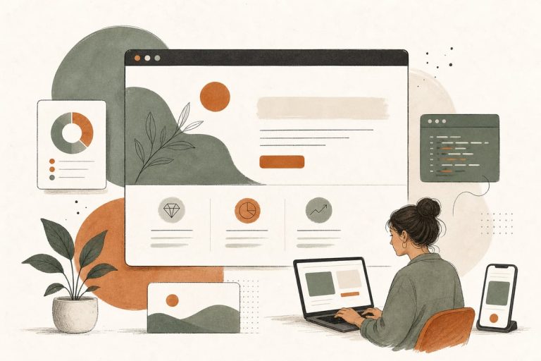
What to Put Above the Fold on a Small-Business Website Homepage
Your homepage should answer three things immediately: what you do, who you help, and what the visitor should do next. If those answers are not clear in the first screen view, you are probably losing customers who were ready to contact you.
Why above-the-fold content matters
“Above the fold” means the part of your homepage people see before they scroll. On mobile, this area is especially small, so every element has to earn its place.
For many small businesses, the homepage is not where people do deep research. It is where they decide whether your business looks relevant, trustworthy, and easy to contact. If the top of the page is unclear, slow, cluttered, or generic, visitors often bounce and call someone else.
A strong above-the-fold section helps with:
- Getting more calls and form submissions
- Improving mobile conversions
- Reducing confusion for first-time visitors
- Making paid traffic and SEO traffic work better
- Helping AI answer engines and searchers understand what your business does
This is not about trendy design. It is about clarity and action.
The 7 things your homepage should show first
Here is the simplest version of a high-performing above-the-fold layout for most service businesses.
1. A clear headline
Your headline should say what you do in plain English. Not a slogan. Not a clever phrase. Not “solutions for a changing world.”
Good headline examples:
- Family Dentistry in Pasadena for Cleanings, Implants, and Emergency Visits
- Los Angeles Employment Lawyer for Wrongful Termination and Workplace Disputes
- HVAC Repair and Installation in Glendale With Same-Day Service
- Custom Websites for Small Businesses That Need More Calls and Leads
A strong headline usually includes:
- The service
- The type of customer or location
- Sometimes the main outcome
If a stranger lands on your site for 3 seconds, they should know they are in the right place.
2. A supporting subheadline
Your subheadline should reduce friction and add context. This is a good place to mention what makes you easier, faster, safer, or more specialized.
Examples:
- Get a free estimate, fast scheduling, and direct communication with our local team.
- Serving patients across Burbank and nearby areas with flexible appointments and transparent pricing.
- Built for businesses that need speed, security, SEO, and a site they actually own.
Keep it short. One to two sentences is enough.
3. One primary call to action
Do not make visitors choose between 6 different next steps. Pick the main action you want.
Examples:
- Book a Consultation
- Call Now
- Request a Quote
- Schedule an Appointment
Then support it with one secondary option if needed, such as:
- Text Us
- See Pricing
- View Services
Too many buttons often lower response rates because people hesitate instead of acting.
4. A visible phone number or contact path
If your business depends on inbound leads, the top of the page should make contacting you effortless.
That might include:
- A clickable phone number in the header
- A “Call Now” button on mobile
- A short contact form link
- A booking button
- A text/chat option if your team actually responds quickly
The best contact method depends on your business model, but hiding all contact options behind multiple clicks is a common mistake.
5. Trust signals
Visitors need a reason to believe you. Above the fold is a good place for light trust elements, not a giant wall of badges.
Useful trust signals include:
- Star rating summary
- Number of years in business
- Licensed/insured if relevant
- City or service area
- Well-known associations or certifications
- “Serving clients across…” language
Examples:
- Trusted by homeowners across the San Fernando Valley
- Licensed and insured
- 20+ years serving Los Angeles families
Keep trust signals believable and specific. Do not overcrowd the hero section.
6. A relevant image or visual
Your hero image should support the message, not distract from it.
Better choices:
- Your team
- Your office, clinic, trucks, or job site
- A product screenshot or dashboard if you sell software or digital services
- A simple custom graphic explaining the process
Weaker choices:
- Generic handshake stock photos
- Random city skylines with no business relevance
- Huge sliders that push the message down
- Autoplay video that slows the page
If the image does not help someone trust you or understand the service, it may not belong there.
7. A mobile-friendly layout
Most small-business traffic is mobile-heavy, especially for local services. Above the fold on mobile often determines whether someone calls you now or leaves.
On mobile, prioritize:
- Short headline
- Short subheadline
- One obvious CTA
- Tap-to-call access
- Fast load time
- Readable text without pinching or zooming
A desktop hero that looks great in a design mockup can fail badly on a phone if the text is too long or the CTA gets buried.
What small businesses often get wrong
If your homepage is underperforming, one of these issues is usually near the top.
Vague messaging
If your homepage says things like “We help businesses thrive” or “Excellence in every detail,” visitors still do not know what you do.
Too many choices
When the first screen offers call, form, booking, chatbot, newsletter, financing, social links, and 8 navigation items, people stall.
No local relevance
If you depend on local customers, your homepage should clearly mention your city or service area.
Weak or hidden CTA
If the call to action is small, low-contrast, or pushed below the fold, you are making lead generation harder than it needs to be.
Slow-loading hero sections
Large video backgrounds, oversized images, sliders, and bloated page builders often hurt load speed right where first impressions happen.
Generic stock visuals
These make your business feel interchangeable. Real photos usually build more trust.
A simple above-the-fold formula by business type
Different businesses need slightly different emphasis.
For law firms
Lead with practice area + location + consultation CTA.
Example:
- Los Angeles Probate Lawyer for Trust, Estate, and Inheritance Disputes
- Schedule a Confidential Consultation
Trust signals can include bar admissions, years of practice, and review summaries.
For clinics and healthcare practices
Lead with specialty + patient benefit + appointment CTA.
Example:
- Pediatric Dentistry in Torrance With Gentle Care and Flexible Scheduling
- Request an Appointment
Include insurance or availability notes only if they are truly useful and current.
For contractors and home services
Lead with service + area + fast response CTA.
Example:
- Roof Repair in Burbank and Glendale With Fast, Honest Estimates
- Call for a Free Estimate
Trust signals like licensed/insured and service area matter a lot here.
For nonprofits
Lead with mission + audience served + key action.
Example:
- Helping South LA Families Access Free After-School Programs
- Donate, Volunteer, or Get Help
Clarity matters just as much as emotion.
How to improve your homepage without a full redesign
You do not always need a complete rebuild. Often, the fastest ROI comes from rewriting and reorganizing the top section.
Use this checklist:
- Rewrite the headline so it clearly states the service
- Add your city or service area
- Reduce to one primary CTA and one secondary CTA
- Make your phone number clickable and visible
- Replace generic hero imagery with a real photo or cleaner visual
- Add 1 to 3 trust signals near the CTA
- Cut unnecessary text
- Test the page on your own phone
- Check load speed for the homepage hero section
- Review whether the CTA stays visible or easy to reach on mobile
If traffic is decent but leads are weak, this is one of the highest-leverage places to start.
How to tell if your above-the-fold section is costing you leads
Look for these warning signs:
- People visit your homepage but do not contact you
- Mobile traffic is high but conversions are low
- Visitors spend only a few seconds on the page
- Sales calls reveal that prospects were confused about what you do
- Your ads are getting clicks, but not enough inquiries
- Your site “looks nice” but does not produce steady leads
A homepage should not just look modern. It should move people toward action.
The goal is clarity, not cleverness
Small-business websites often underperform because the top of the homepage tries to impress instead of inform. In most cases, a clear headline, one strong CTA, visible contact info, and a few trust signals will outperform a flashy but confusing hero section.
If you want your website to bring in more customers, start with the first screen people see. It is one of the simplest places to improve conversions without overhauling your entire site.
If you want help reviewing your homepage, messaging, mobile layout, or conversion path, you can book a free consultation at https://webmasterandmore.com/consultation.
Frequently asked questions
What does “above the fold” mean on a website?
It means the part of the page visible before a visitor scrolls. On mobile, this area is smaller, so the content has to be especially clear.
Should I put a slider on my homepage?
Usually no. Sliders often dilute the message, slow down the page, and hide your main call to action.
How many buttons should I have above the fold?
For most small businesses, one primary CTA and one secondary option is enough.
Should my homepage mention my city?
Yes, if you serve a local market. Location helps both users and search engines understand relevance.
Can I improve homepage conversions without a full redesign?
Yes. Rewriting the headline, simplifying the CTA, improving mobile layout, and adding trust signals can make a meaningful difference. If you want a professional review, schedule a free consultation at https://webmasterandmore.com/consultation.